minstudio

가상 클래스와 가상 요소 (Pseudo)

HTML 코드에는 없지만, 브라우저가 알고 있는 특별한 상태나 순서를 디자인할 때 사용합니다.
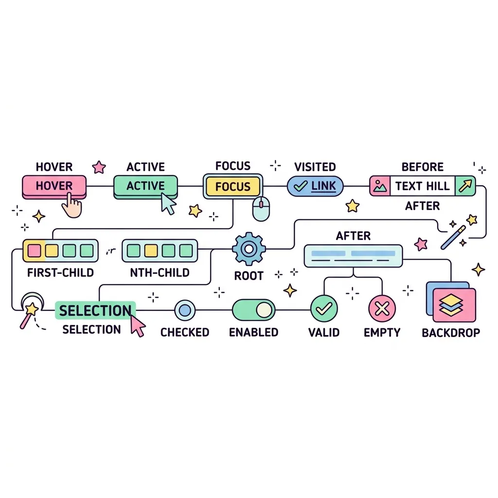
가상 클래스 설명 및 활용
:hover 마우스 포인터가 요소 위에 올라가 있을 때 적용됩니다. (주로 버튼이나 링크에 사용)
:active 사용자가 요소를 클릭하여 누르고 있는 순간에 적용됩니다.
:focus 입력창(input) 등을 클릭해서 포커스(커서)가 맞춰져 있을 때 적용됩니다.
:first-child 형제 요소들 중 첫 번째인 요소에 적용됩니다.
:last-child 형제 요소들 중 마지막인 요소에 적용됩니다.
:nth-child(n) 형제 요소들 중 n번째인 요소에 적용됩니다. (예: 2n 짝수, 2n+1 홀수)

마우스 반응형 버튼 구조

기본 상태
(평상시)
:hover
(마우스 오버)
:active
(클릭하는 순간)

HTML에 <div>를 추가하지 않고도, 오직 CSS만으로 가짜 요소를 창조해내는 마법입니다. 장식용 디자인(아이콘, 뱃지, 밑줄 등)을 넣을 때 HTML을 더럽히지 않기 위해 사용합니다.

::before & ::after 위치 다이어그램

어떤 요소(예: 버튼) 안에 가상 요소가 생성되는 위치
선택된 요소 (예: <button>)
::before
실제 내용 (Content)
::after

가상 요소는 요소의 바깥이 아니라 '안쪽'에 생성됩니다!
::before는 내용의 맨 앞에, ::after는 내용의 맨 뒤에 자식 요소처럼 추가됩니다.

필수 속성 주의

content: ""; 속성을 빼먹으면 화면에 아예 나타나지 않습니다! (빈 문자열이라도 꼭 넣어야 합니다)

<div class="test-container">
    <div>
        <strong>1 & 2. 버튼 테스트 (:hover, :active)</strong><br><br>
        <button class="btn">마우스를 올리고 클릭해보세요!</button>
    </div>
    
    <div>
        <strong>3. 입력창 테스트 (:focus)</strong><br><br>
        <input type="text" placeholder="여기를 클릭해서 입력해보세요...">
    </div>
    
    <div>
        <strong>4. 목록 테스트 (:nth-child)</strong><br><br>
        <ul>
            <li>첫 번째 아이템 (홀수)</li>
            <li>두 번째 아이템 (짝수)</li>
            <li>세 번째 아이템 (홀수, 빨간색)</li>
            <li>네 번째 아이템 (짝수)</li>
        </ul>
    </div>
</div>
<hr style="margin:20px 0; border:none; border-top:2px dashed #ccc;">
<style>
/* --- 가상 요소 스타일 --- */
/* 기본 뼈대 스타일 */
.test-container { display: flex; flex-direction: column; gap: 40px; padding: 20px; align-items: flex-start; }
.btn-new { padding: 12px 24px; background: #3b82f6; color: white; border: none; border-radius: 8px; font-weight: bold; font-size: 1rem; }
.card { width: 200px; height: 100px; background: white; border: 1px solid #e2e8f0; border-radius: 12px; display: flex; align-items: center; justify-content: center; font-weight: bold; position: relative; }

/* 1. 내용(content) 추가하기 (::before) */
/* 버튼 글씨 앞에 반짝이는 아이콘 추가 */
.btn-new::before {
    content: "✨";
    margin-right: 8px;
}

/* 2. 장식용 요소 만들기 (::after) */
/* 박스 뒤에 그림자 효과를 위한 가짜 상자 만들기 */
.card::after {
    content: "";
    display: block;
    width: 100%;
    height: 100%;
    position: absolute;
    top: 8px; left: 8px;
    background: rgba(0,0,0,0.1);
    border-radius: 12px;
    z-index: -1;
}
</style>

<div class="test-container">
    <div>
        <strong>1. ::before (요소 내부의 맨 앞에 추가)</strong><br><br>
        <button class="btn-new">새로운 업데이트</button>
    </div>
    
    <div>
        <strong>2. ::after (요소 내부의 맨 뒤에 추가)</strong><br><br>
        <div class="card">카드 내용</div>
    </div>
</div>
실행 결과
가상 클래스와 가상 요소 (Pseudo) | Minstudio