minstudio

Flexbox

🪄 가로/세로 정렬의 마법, Flexbox

현대 웹 레이아웃에서 가장 많이 쓰이는 Flexbox입니다. 부모 요소에 display: flex를 선언하면 자식들을 한 방향(가로 또는 세로)으로 쉽게 정렬할 수 있습니다.

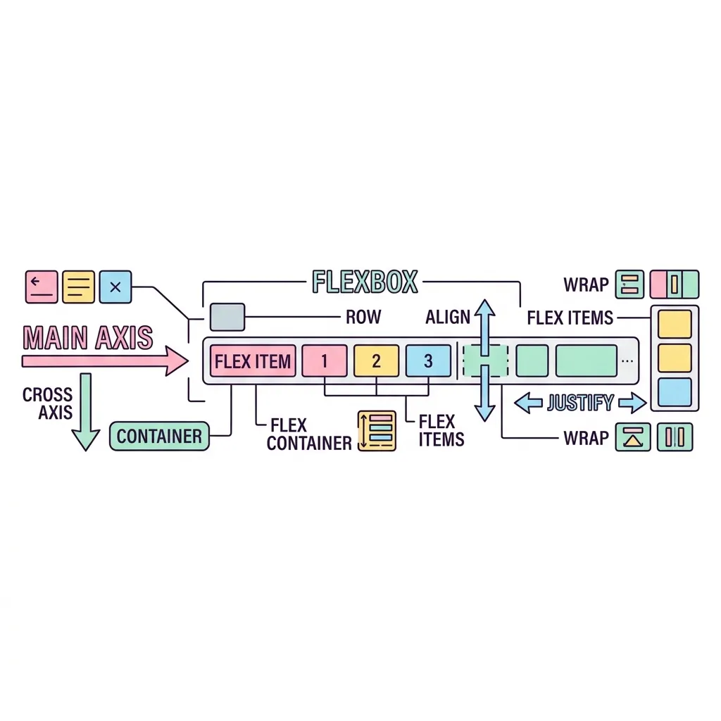
Flexbox 주축과 교차축 (정렬 방향)

justify-content (flex-direction: row 기준)
주축 (Main Axis)
교차축 (Cross Axis) align-items
Item 1
Item 2
Item 3

justify-content주축(Main Axis)을 따라 아이템들을 정렬하며,
align-items교차축(Cross Axis)을 따라 아이템들을 정렬합니다.
(※ flex-direction: column으로 설정하면 두 축의 방향이 서로 바뀝니다!)

justify-content (주축 정렬)

flex-start
center
flex-end
space-between
space-around
space-evenly

align-items (교차축 정렬)

stretch (기본값)
flex-start
center
flex-end
baseline
A
B
C

💡 요소들을 화면 정중앙에 배치하고 싶다면 flex와 justify-content, align-items를 활용하세요!

심화 학습

Flexbox 심화 (자식 속성: 크기 분배)

Flexbox에서 자식 요소들은 마치 고무줄처럼 화면 넓이에 따라 유연하게 줄어들거나 늘어납니다.

flex-grow (여백 나눠 갖기) 다이어그램

기본 상태 (남는 공간 발생)
A (80px)
B (80px)
남는 공간 (빈 여백)
A가 1, B가 2의 비율로 남는 공간을 나눠 가질 때
A (flex-grow: 1)
B (flex-grow: 2)

A와 B의 flex-grow 비율이 1 : 2라면,
전체 공간에서 1:2로 나누는 것이 아니라, 남는 빈 공간을 3등분하여 A가 1만큼, B가 2만큼 추가로 가져가며 커집니다!

<div class="flex-container">
  <div class="item">Item 1</div>
  <div class="item">Item 2</div>
  <div class="item">Item 3</div>
</div>
<!-- ====== Flexbox 심화 (자식 속성: 크기 분배) ====== -->
<div style="margin: 30px 0; border-top: 1px solid #475569;"></div>
<style>
.flex-container-adv {
    display: flex; /* Flexbox 활성화 */
    flex-direction: row; /* 주축 방향 (값: row, column, row-reverse, column-reverse) */
    flex-wrap: nowrap; /* 줄바꿈 (값: nowrap, wrap, wrap-reverse) */
    justify-content: flex-start; /* 가로 정렬 (값: flex-start, center, flex-end, space-between, space-around, space-evenly) */
    align-items: stretch; /* 세로 정렬 (값: stretch, flex-start, center, flex-end, baseline) */
    gap: 10px; /* 자식 요소 사이의 여백 (예: 10px, 1rem) */

    background: #1e293b;
    padding: 15px;
    border-radius: 12px;
}

.flex-item {
    flex-grow: 0; /* 빈 공간이 남을 때 추가로 차지할 비율 (값: 0, 1, 2 등) */
    flex-shrink: 1; /* 공간이 모자랄 때 찌그러지는 비율, 0이면 안 찌그러짐 (값: 0, 1 등) */
    flex-basis: auto; /* 기본 시작 크기, width/height를 덮어씀 (값: auto, px, % 등) */
    flex: 0 1 auto; /* 위 3개를 한 번에 단축 (값: grow shrink basis) */
    order: 0; /* 시각적 배치 순서 (값: 정수, 음수 포함, 기본값 0) */
    align-self: auto; /* 이 아이템 하나만 교차축 정렬 (값: auto, stretch, flex-start, center, flex-end) */

    background: #6366f1;
    color: white;
    padding: 20px;
    border-radius: 8px;
    font-weight: bold;
    text-align: center;
}

.flex-item-1 { flex-grow: 1; background: #f43f5e; }
.flex-item-2 { flex-grow: 2; background: #10b981; }
.flex-item-3 { order: -1; background: #f59e0b; }
</style>
<div class="flex-container-adv">
    <div class="flex-item flex-item-1">flex-grow: 1</div>
    <div class="flex-item flex-item-2">flex-grow: 2</div>
    <div class="flex-item flex-item-3">order: -1 (제일 앞)</div>
</div>
실행 결과
Flexbox | Minstudio